
The award-winning craftsperson contemplates the dark moral universe
she helped Guillermo del Toro create for Nightmare Alley, his visually rich period noir.

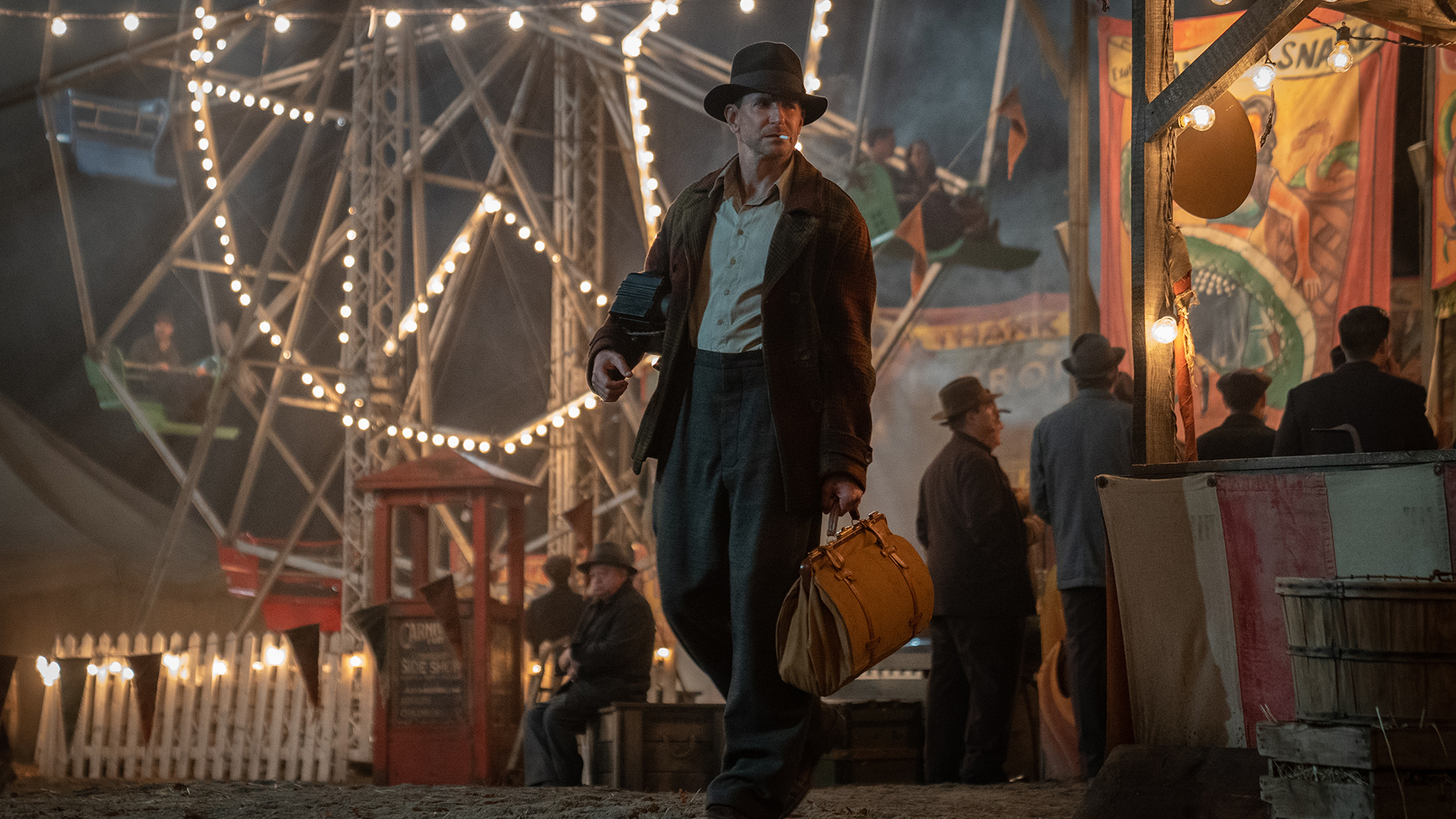
Guillermo and I tend to talk in visuals. With Nightmare Alley, we began by looking at carnival imagery – photographs from the 1920s to the 1940s – figuring out what we did and didn’t like. Knowing he would love to have a lot of banners in the carnival section of the film, we looked at a lot of banner art. From there, we began to explore how we would incorporate certain architectural themes. Much of the conversation with Guillermo involves knowing intuitively what he likes. He’s the kind of director who’ll find inspiration in an older film. For instance, the ‘Ten-in-One’ sign in the carnival was a riff on a similar one from a Hitchcock film. And later, when Molly’s [Rooney Mara] on the phone in the hotel, there’s this black and white cab phone box, where you order a cab by just pressing a button. Guillermo sent us a still from Billy Wilder’s The Lost Weekend (1945) that featured it. Only a real Guillermo del Toro nerd is going to notice these things. We also researched the Danish artist Vilhelm Hammershoi, Edward Hopper for colours of the era and Henri Matisse for carnival colours. And I was pushing for the Blue Period of Pablo Picasso, to give a certain tonality to the carnival. We looked at sculpture because we created a lot of sculpted pieces for places like Ezra Grindle’s [Richard Jenkins] mausoleum and his garden. You might not see them all in the film, but they’re there.
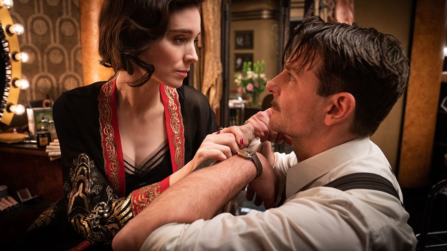
Guillermo also writes biographies of all the main characters, which he gives to the department heads and the actors. He goes into detail about the characters and their backgrounds – where they came from, what their parents did. We know what smells Molly likes, the person she was as a child and that she enjoys eating chocolate. Molly also likes shoes, so we created a specific place for them in her caravan.
Nightmare Alley (2021)
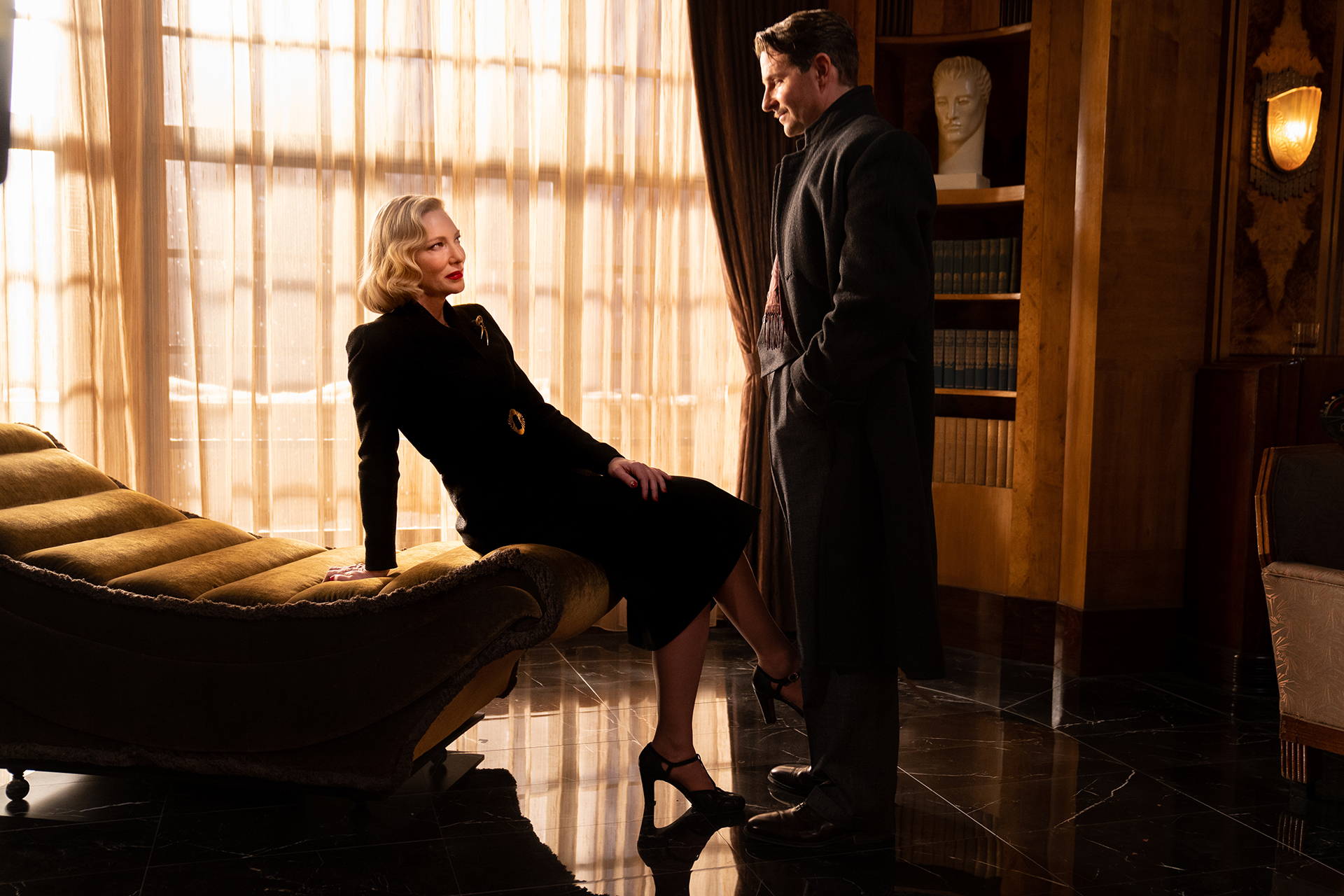
Two key motifs in the film were circles and alleys. The geek pit was a circle and that became a repeated form throughout the film, even seeping into the art deco designs. Stanton [Bradley Cooper] is always seen in a circle. We had him encircled in the dressing room of the Copacabana and in the geek pit. Then, at the very end, there’s a big round window in the circus owner’s trailer. It was playing with the idea that he is a caged animal. Then there were places like Lilith’s [Cate Blanchett] office. That was originally square, but Guillermo kept wanting to make it longer. There were the corridors outside her office, which were partly our set-build and partly on location in Buffalo [New York State]. We picked them because they were these long, simple hallways. And there were the trains. We art-directed how the train carriages were set up so that they resembled another long alley. Stan was essentially on a journey with no destination. And unlike the other characters, he has no place of his own.Lilith has her office, Zeena [Toni Collette] and Pete [David Strathairn] have the cottage and a place either on or below the stage. Even Molly has her caravan. But Stan remains homeless. Throughout the film, he experiences enormous changes, but deep down his character doesn’t really change. He doesn’t resolve anything, instead ending up where he began.
Stan is always the visitor, which is a challenge for me as a designer because I like to work with characters, developing them into the sets I design. That’s what I did with Lilith’s office. Firstly, knowing Cate Blanchett was taking on that role inspired me. It was a very different character for her, which was interesting. Then I thought about how she would move in the fantastic streamline costumes Luis [Sequeira] designed and the way Guillermo had her moving through that space. All these elements were inspirational for me. But her character is essential. Lilith is a damaged, but really powerful woman, in a time – the 1940s – when it was hard to be a powerful, smart and educated woman. Unlike Stan, there was a lot there for me to work with when it came to designing her office. I wanted the art deco wood panels to dial up a contrast between warmth and cold – the wood against the cold marble floors. We originally had carpeting, inspired by the French-designed Weil-Worgelt Study that’s housed in the Brooklyn Museum. I showed it to Guillermo, thinking of this wood with these veneer, Rorschach-like patterns. It looked cool. But I wanted to take it to another level, make everything a little bit more exaggerated and intense, while also playing up the art deco trends of the time. The design was very angular at first. That was my take on Lilith. But it was actually Guillermo who suggested we add some arches, softening it a little and making it more feminine. So we introduced arches and curves into the walls. The office was the size of a train carriage by the time we finished.
Lighting is key in Lilith’s office. We had many talks with cinematographer Dan Laustsen regarding how he wanted to change the lighting through the different scenes. He lit that place masterfully. We had that giant skylight in the ceiling, which initially posed a lot of challenges for him. There was discussion about not having it because it was too difficult. But Dan embraced it and used the light to effect different changes, not only day-to-night, but also the mood. He lit it so beautifully. And it made my work look good.
This article originally appeared in the Awards Journal, our awards-season magazine. Pick up your free copy at your local Curzon while stocks last.