
As the rainbow-bright Asteroid City arrives in cinemas, Georgina Guthrie considers how Wes Anderson, and a handful of other filmmakers, use colourful production and costume design to subvert expectations.

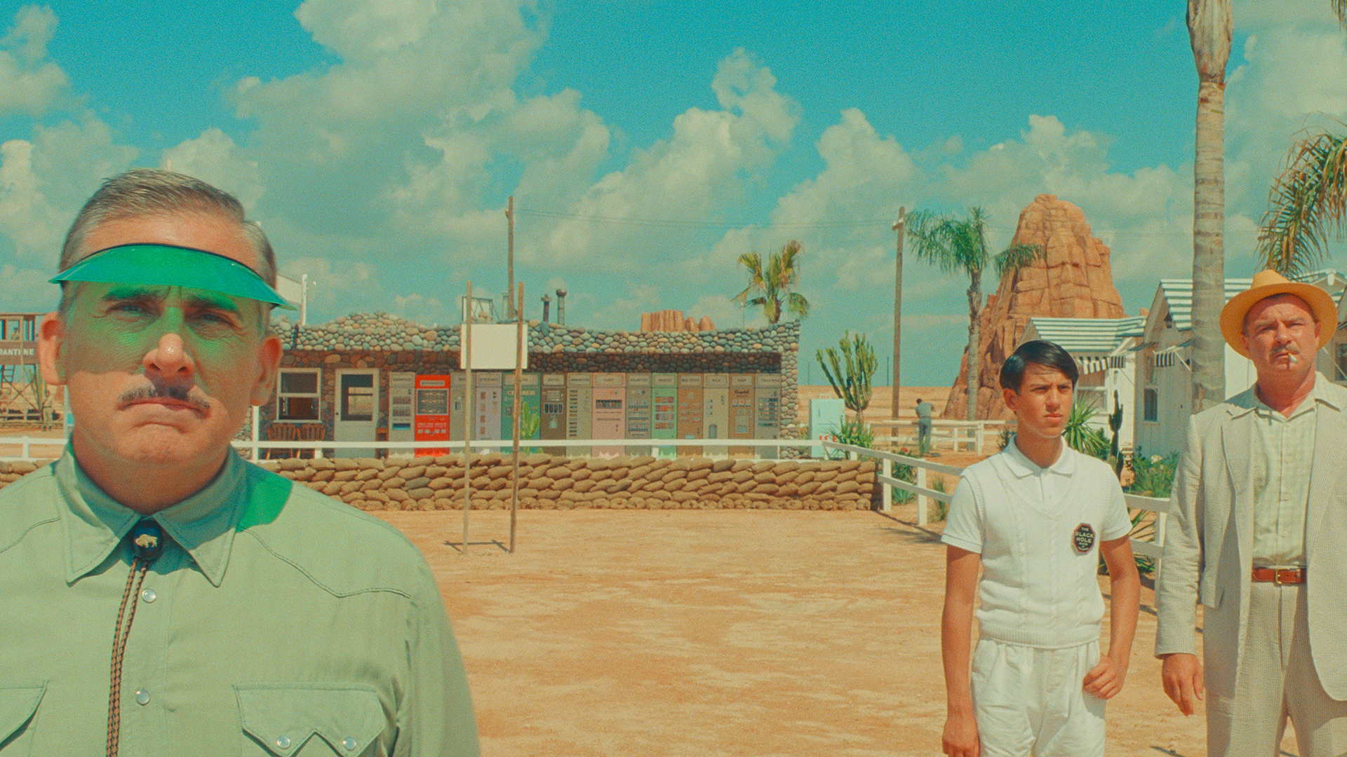
Pastels are the most deceptive of hues, and the films that use them are about as trustworthy as cotton wool wrapped around barbed wire. Even Wes Anderson, a filmmaker renowned for his pristine visions, uses buttercup and candyfloss to conceal his films’ darkness, where yearning, melancholy, fear and regret lurk underneath those immaculate-looking surfaces. With electric blues, sulphur yellows and acid greens overpowering softer pastels, the inimitable auteur’s latest, Asteroid City, has a harsher palette than is customary, but that blend of nostalgia and melancholic ache remains.
Despite the colour fluctuations, Anderson’s idiosyncratic style is so recognisable, so precise across each of his post-2000 movies – pastels, symmetry, droll humour and bursts of retro pop– a single scene is enough to identify its filmmaker’s fingerprints (which fans have recreated in a viral pastels trend on TikTok, much to his annoyance). But bright shades do double duty for Anderson, a director who focuses almost exclusively on the mid-century. While undoubtedly dialled up in the name of style, Anderson’s palettes are true to his chosen era. His films are also odes to long-lost worlds – and his deceptively cheerful hues often offer an ironic counterpart to ominous subject matter.
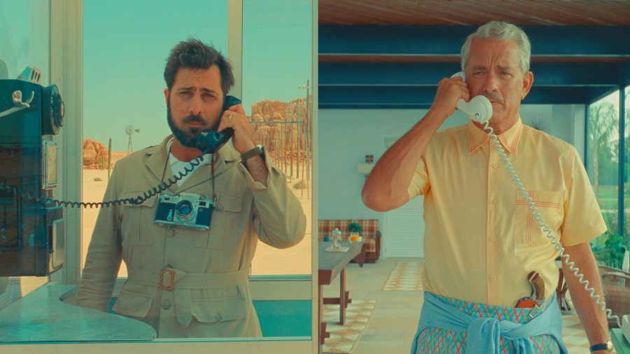
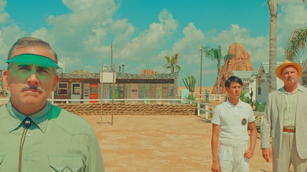
Asteroid City (2023)
The Grand Budapest Hotel (2014), arguably most emblematic of his style, follows M. Gustave (Ralph Fiennes), a famous hotel concierge who’s framed for the murder of a wealthy dowager. He and his lobby-boy protégé Zero (Tony Revolori) set off on a quest to clear his name and claim a priceless Renaissance painting against a turbulent political backdrop. At face value, it’s a comedic crime caper – and with its candy-hued hotel, meticulous symmetry and hand-painted scenery (the pastel-pink funicular being a particular highlight) – it offers peak Wes style. But behind the pretty artifice beats a sadder, darker heart. Grand Budapest presents an unexpectedly violent world where fingers are sliced off, a cat is fatally defenestrated and someone literally loses their head. ‘I’ve never had a movie before where there’s this much blood,’ Anderson told The Playlist at the time.
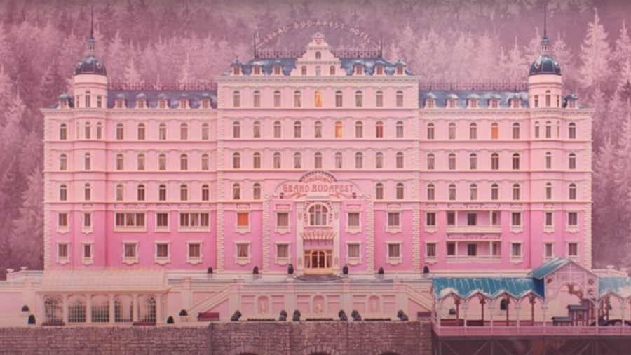
The Grand Budapest Hotel (2014)
More sinister, though, is the fascism, immigration, death and war that crop up. ‘Well, you see, my father was murdered and the rest of my family were executed by firing squad. Our village was burned to the ground and those who managed to survive were forced to flee,’ says Zero in response to a racist rant from Gustave. Later, as the fascists take control, jet-black flags and uniforms mar the pretty pastel sets, as darkness literally and thematically closes in. When the once famous Grand Budapest Hotel falls into disrepair, and its ageing new owner/former lobby boy (F. Murray Abraham) tells the story of its creep into dilapidation, those pastels, like the shades of a faded photograph, offer nostalgia tempered by the ache of happier times lost.
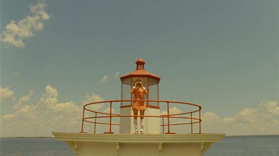
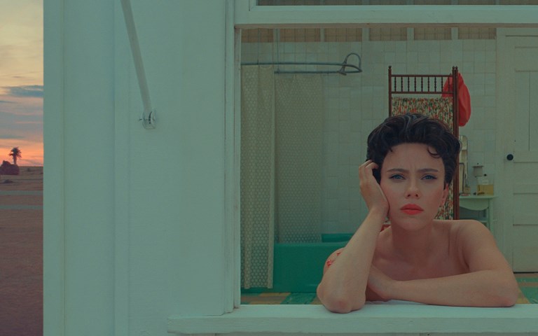
Moonrise Kingdom (2012)
It’s the same story with Moonrise Kingdom (2012), Anderson’s longing-fuelled tale of Suzie (Kara Hayward) and Sam (Jared Gilman), two teen lovers on the lam. ‘I think it’s a moment before lots of things changed,’ Anderson said of his decision to set the film during the Sixties. Suzie’s house is even named ‘Summer’s End’. It also unspools during a transitional season, shown by the sets that fluctuate from late-summer to mid-autumn. Pastel pink, powder blue and a spectrum of yellows (all popular shades of the era) feature heavily, though not universally: more muted, autumnal colours intrude during the scenes with the smitten runaways and, as they camp out, bare branches are a reminder that their idyll is as fleeting as youth. As with The Grand Budapest Hotel, light hues also provide an unexpected backdrop for violence and sadness. Suzie stabs a boy with scissors, a dog is fatally skewered, and mentions of electroshock therapy, orphanages and depression fall as thickly as the autumn leaves.
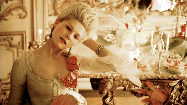
The 18th century is an era less associated with sugary shades in the popular consciousness, but Sofia Coppola’s unconventional Kirsten Dunst-starring biopic Marie Antoinette (2006) – a film panned at Cannes for its lack of historical accuracy – is, in fact, historically accurate, at least on the sartorial front. Like Anderson, the director uses soft, pale colours for their beauty, as well as subversion. Hot-pink Sex Pistols-esque opening credits appear to the tune of ‘Hong Kong Garden’ by Siouxsie and the Banshees, kicking notions of stately pomp out the window from the beginning. What follows is a story of privilege, power and celebrity, as well a heartbreaking portrait of a disempowered yet highly visible girl who pays the ultimate price for her failure to conform.
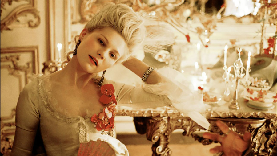
Marie Antoinette (2006)
As part of her research of costumes of the era, Coppola visited Andrew Bolton, head curator for the Metropolitan Museum of Art’s Costume Institute. ‘The colours of those clothes, they were minty greens and pinks and colours that you wouldn’t expect,’ she said. ‘In movies they always look more faded or earth-toned. So I was struck by that, that was sort of the starting point.’ ‘Struck’ is the right word, and it’s an effect the film has on viewers: Coppola hits us with a rainbow of hyper-feminine pastels in shoes, ribbons, patisserie, voluminous gowns, and towering hair wrought into curls and piled on top of our heroine’s head.
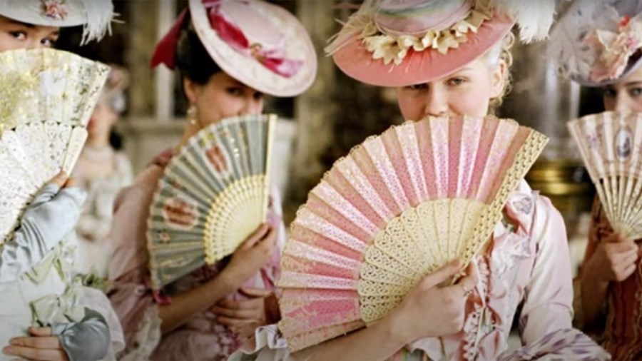
Marie Antoinette (2006)
Those playful hues that appear in the girlish accoutrements contrast with shots of her dwarfed against Versailles, her decadent prison. French critics, particularly men, accused the director of focusing on the irrelevant minutiae rather than politics in her study of the maligned monarch – but in focusing on the things over which Marie truly has control, we’re shown just how little power she really has. The personal is the political, much like The Grand Budapest Hotel, in which Zero’s very presence in Mitteleuropa is an indirect reference to far-off war and his refugee status.
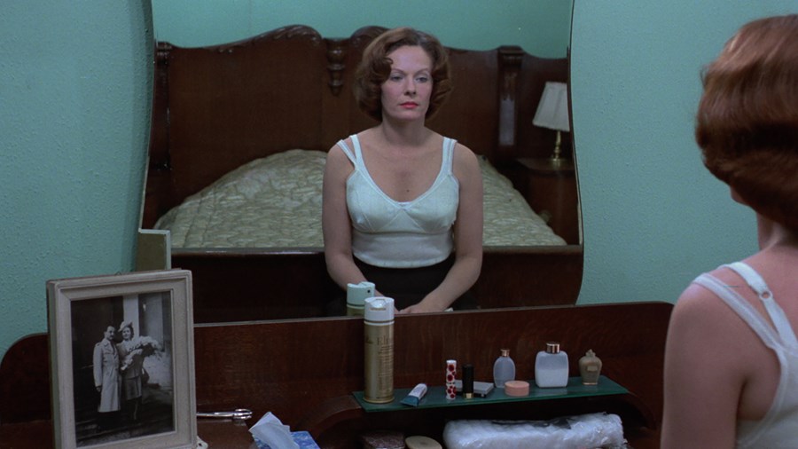
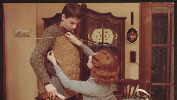
Jeanne Dielman, 23 Quai du Commerce, 1080 Bruxelles (1975)
Another filmmaker who makes personal worlds into political statements is Chantal Akerman. More than 30 years before Coppola’s portrait of female disempowerment, Akerman meticulously depicted the daily routine of Delphine Seyrig’s bourgeois widow in Jeanne Dielman, 23 Quai du Commerce, 1080 Bruxelles (1975), which recently topped Sight & Sound’s Greatest Films of All Time poll. Akerman’s masterpiece has a washed-out palette, dominated by pallid green, pale yellow and the lightest powder pink. Where Coppola adds joyful candy colours to her pastel mix, Jeanne Dielman’s vision offers little visual variety, which mirrors Dielman’s monotonous routine of domestic drudgery. Over its 201-minute runtime, the overwhelming sameness in content and style soon becomes claustrophobic and doom-laden. Marie Antoinette and Jeanne Dielman may have light, traditionally feminine palettes, but theirs are both worlds in which femininity is weaponised, with tragic consequences.
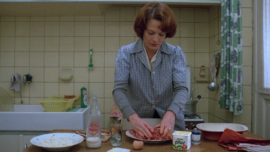
Jeanne Dielman, 23 Quai du Commerce, 1080 Bruxelles (1975)
Heathers (1989), too, is subversive. It’s about Winona Ryder’s Veronica, a high-school girl who’s caught between a clique of girls (all named Heather) and the dangerous drifter JD (Christian Slater) who sets out to kill everyone, initially with her help. He partially succeeds, until Veronica’s moral compass kicks in and she kicks him out. As with each of these films, Heathers’ pastel colour palette is part of its subversion. This was the era of Pretty in Pink (1986) and The Breakfast Club (1985) – peppy, largely pastel-hued teen movies with happy endings. Heathers, which makes fat-shaming, rape and suicide the punchline, feels all the more brutal (and confusing) because its sugary shades share DNA with other teen movies. It flopped on release; its scalpel-sharp satire proved too much for most. Nevertheless, buoyant VHS sales and its still shocking humour earned the film enduring cult status.
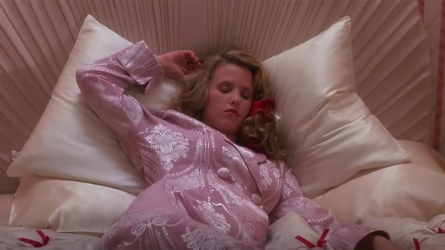
Heathers (1989)
Pastels are most apparent during its high-school scenes. Each of the Heathers wears a primary colour – which pops against the powdery shades, signalling the group’s distinction – with a bright-red scrunchie, the colour of power and danger, passing from Heather to Heather depending on who rules the group. Pastels are also evident just before violence takes place: Heather Chandler swathed in soft pink satin, wholesome as fresh milk, before she drinks drain cleaner and collapses on scarlet carpet; a baby-blue and lavender porn mag lying on Veronica’s bed next to pink chocolates and an ink-dark gun, to name but two examples. Those butter-wouldn’t-melt pinks and yellows form an ironic counterpoint to the film’s pitch-black heart, and later, as bad boy JD ramps up the violence, the style shifts: those summery shades fully transition into giallo-eque blues and blood reds.

Heathers (1989)
A dash of red also makes an appearance in the final act of Jeanne Dielman, followed by an enigmatic smile from the film’s normally composed protagonist. Pastel-attired Marie Antionette dons black to a masked ball, and when she’s in mourning. Even Wes Anderson, with his commitment to whimsy, allows gloomy blues and greys to seep in as Moonrise Kingdom’s teen runaways are torn apart, and a splash of scarlet blood as severed fingers sit on crisp white snow. Proof pastels always reveal their true colours in the end.
WATCH ASTEROID CITY IN CINEMAS